I've never been overly fond of Nike's presence in the hockey marketplace, given the fact that the company's specialties are marketing, basketball, and using slave labour to sell shoes at a 100000% markup.
That said, I've never really felt compelled to speak up until seeing the recent jersey designs for the 2014 Winter Olympics in Sochi.
K.I.S.S. - Keep it simple, stupid!
That's the motto most any designer should follow, especially when it comes to sports uniforms.
The best uniforms in sports? The Yankees, Canadiens, Dodgers, Red Wings... all very simple, elegant designs that use striking colours and a clean look to stand out. They stand the test of time for a reason.
Now, let's look at the awful dreck that Nike has seen fit to produce for these upcoming Olympics.
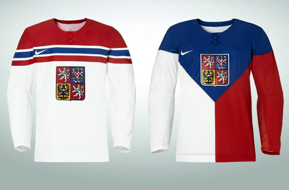
CZECH REPUBLIC
It's a very American thing to wear American-flag suits, pants, shirts, etc... Given the garish design of the American flag, it's a real eyesore to see something like this.
So, Nike decided that the Czechs should basically wear the frickin flag as their hockey sweaters.
The design on the left isn't as bad, even if it does remind me of the Montreal Canadiens.
The one on the right? Yes, they basically took a flag and sewed a crest and logo on it.
I can also imagine the numbering on the back of that second jersey will look awkward.
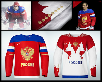
RUSSIA
The one on the left looks just fine, but what the hell is with the pile of garbage on the right? Are we going for a cycling team look?
Did Nike not learn from the disasters that were the LA "Burger King" jerseys? Remember the Anaheim cartoon jerseys? Yeah, this is pretty much in that realm of barfiness.
USA! USA! USA!
The least offensive of the four goes to the USA, although you can tell that Dustin Brown is not too thrilled about them.
Yes, the top part of those shirts has FAKE laces. FAKE LACES!! On top of that, you have a bunch of stars.
Does Nike hire teenage girls to design these things? Why not add some sparkles and glitter?
If you simply removed the extra Ed Hardy crap on top, you'd have a uniform that is actually quite good.
CANADA
These were finally made official, and they might be the absolute worst uniforms Team Canada has ever had to wear.
1. As random commenters have pointed out, these look like the T-Shirts you'd get for free in a 24-pack of Molson Canadian.
You know those really bad replica jerseys you can buy on Ebay for five bucks? I'd take those things over what Nike has come up with.
2. Why does Team Canada need a THIRD jersey for a tournament where they are playing 8-12 games? No other country seems to need a third jersey. I realize this is about money, but shouldn't the IOC or IIHF step in and say "Two is the maximum!"
3. The THIRD version has a weird red armband on the right side (hidden in the one above), and many people have noticed that it looks like an old Nazi armband. Whose clever idea was it to sneak that on there?
---
Whoever picked Nike to design these abominations needs to never use their services again. If I were a player on one of these teams, you can bet I'd speak out and say "I'm proud to be on Team X, but not proud to wear these uniforms."


I have found that this site is very informative, interesting and very well written. keep up the nice high quality writing. Wrestling Singlets
ReplyDelete